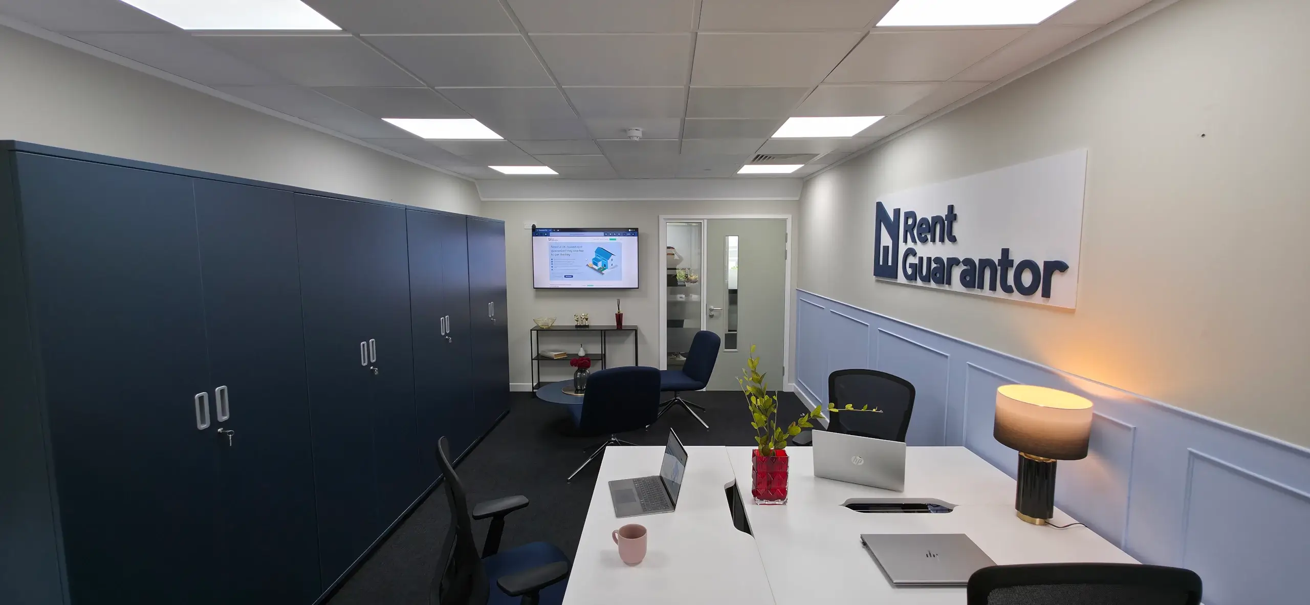
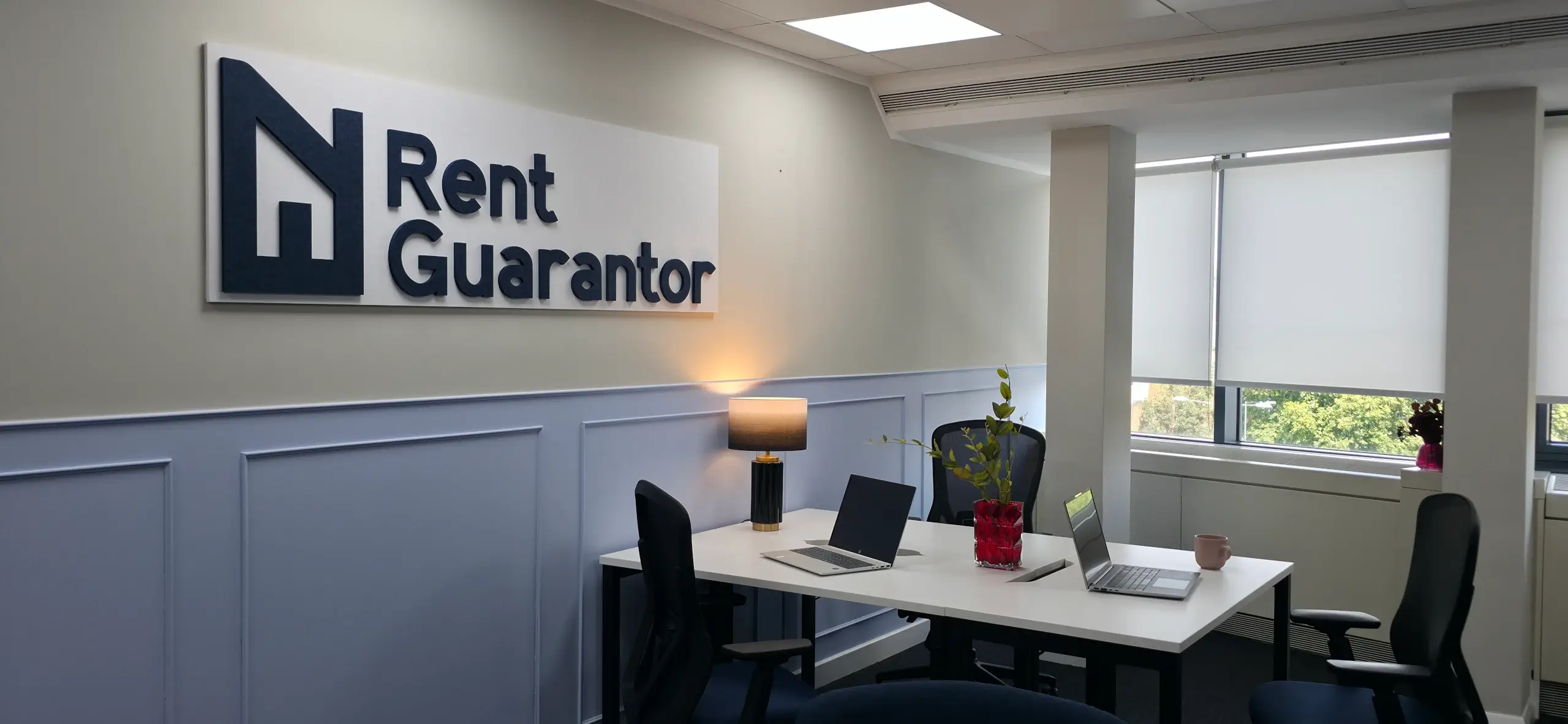
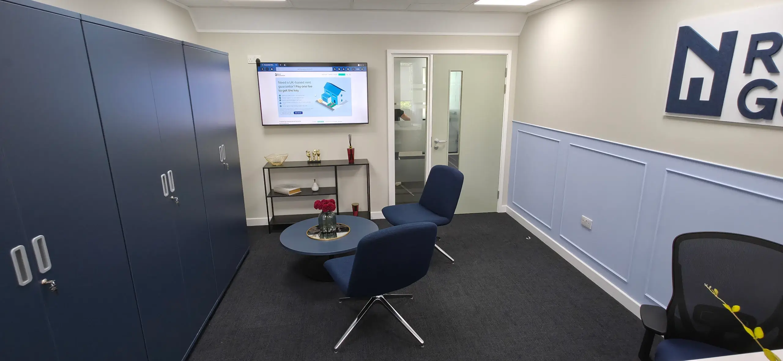
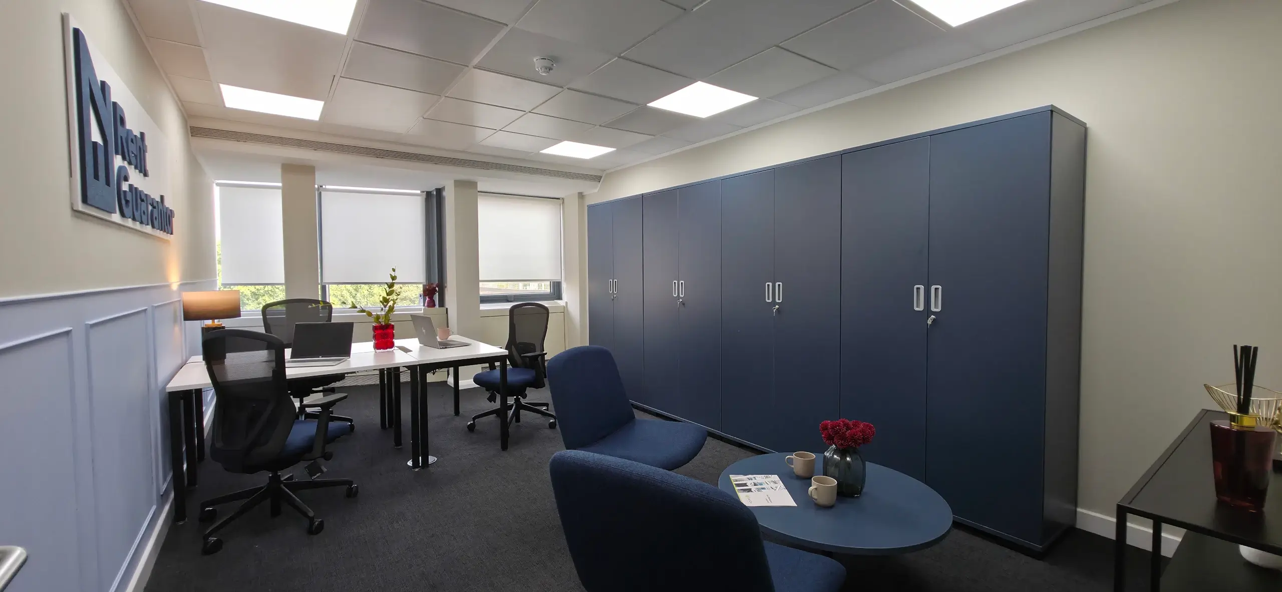
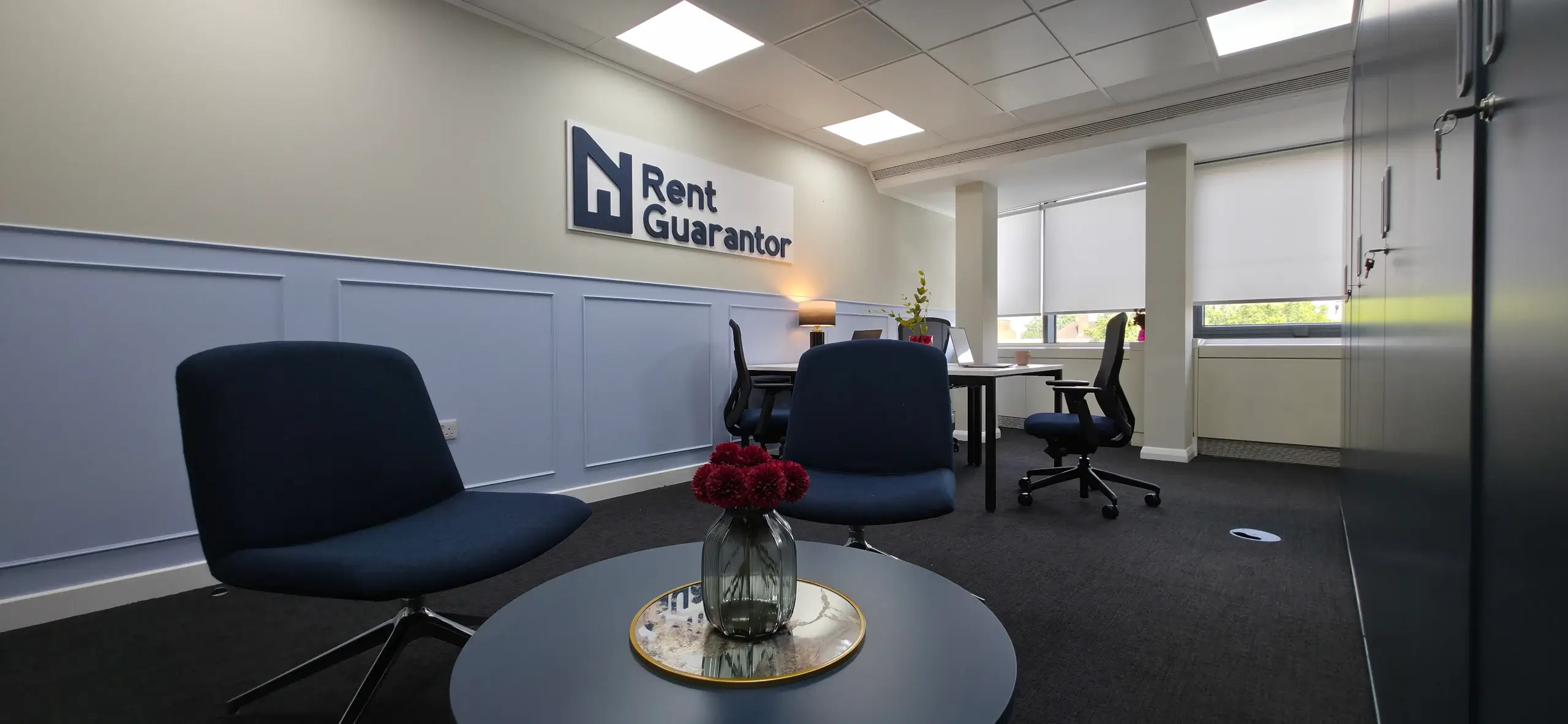
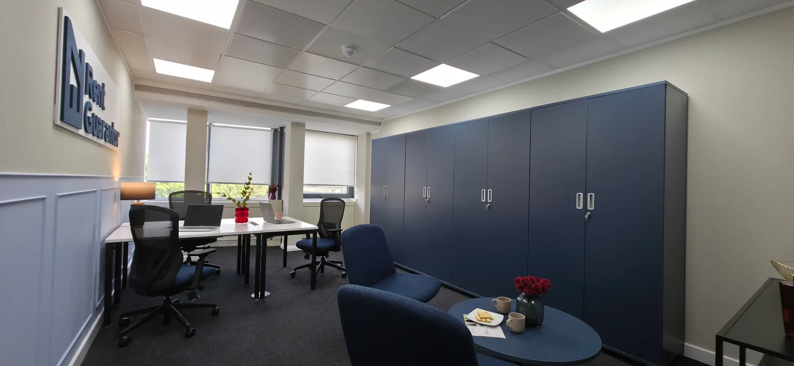
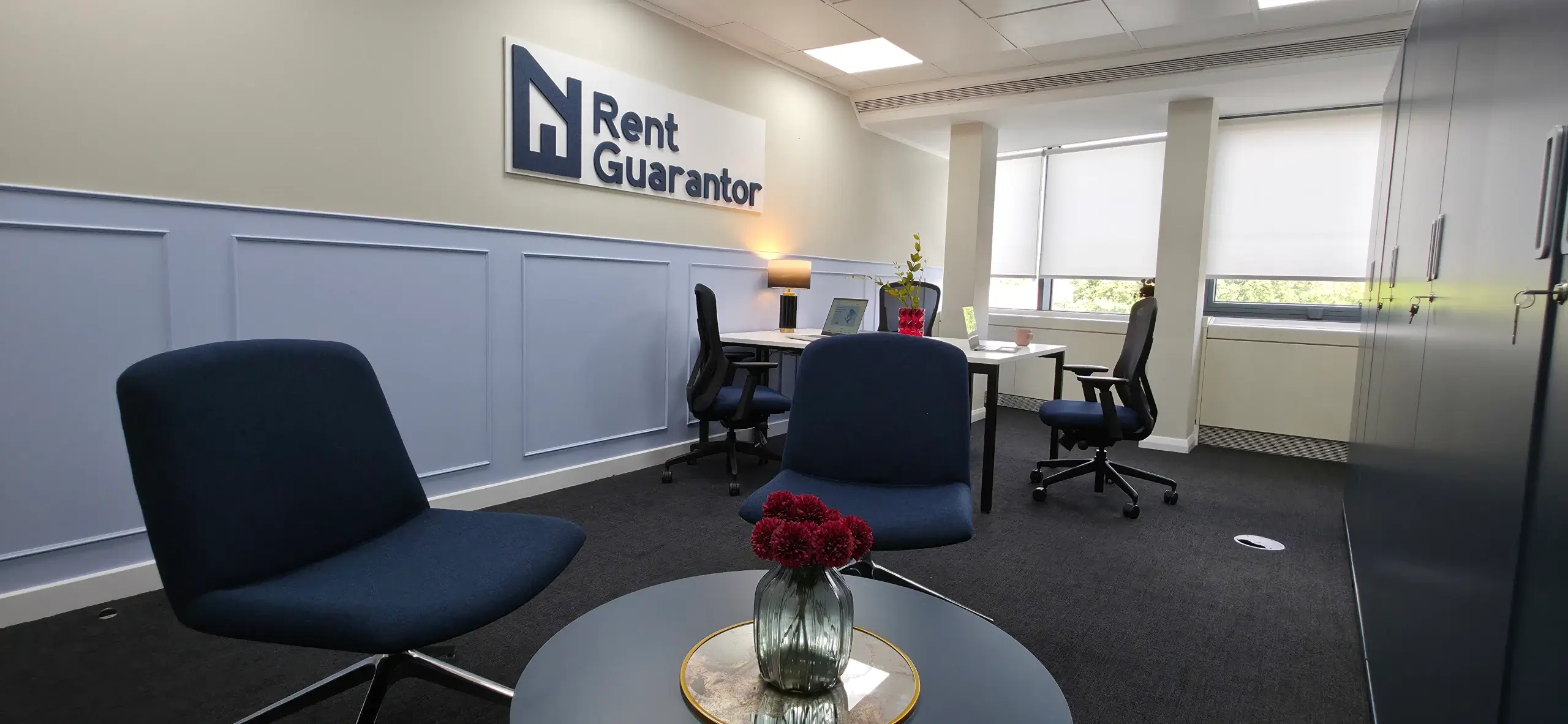
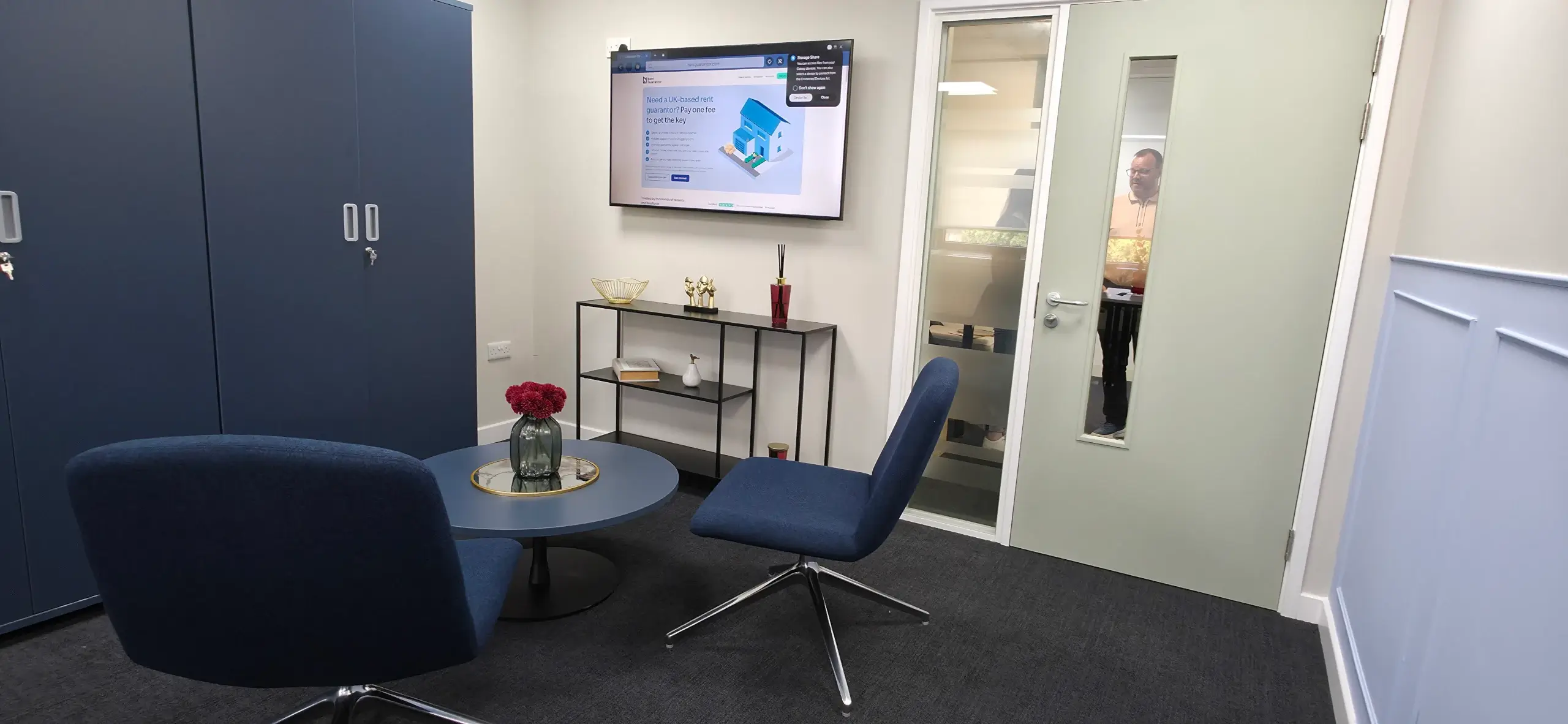
They say that less is more and that was definitely true here! The key for me was the way that the RentGuarantor logo was created as a felt acoustic panel which was wall mounted and then the rest of the space flowed from the use of the brands key dark blue colour, complemented with a lighter blue panelling that was colour matched to the brands secondary Pantone colour.
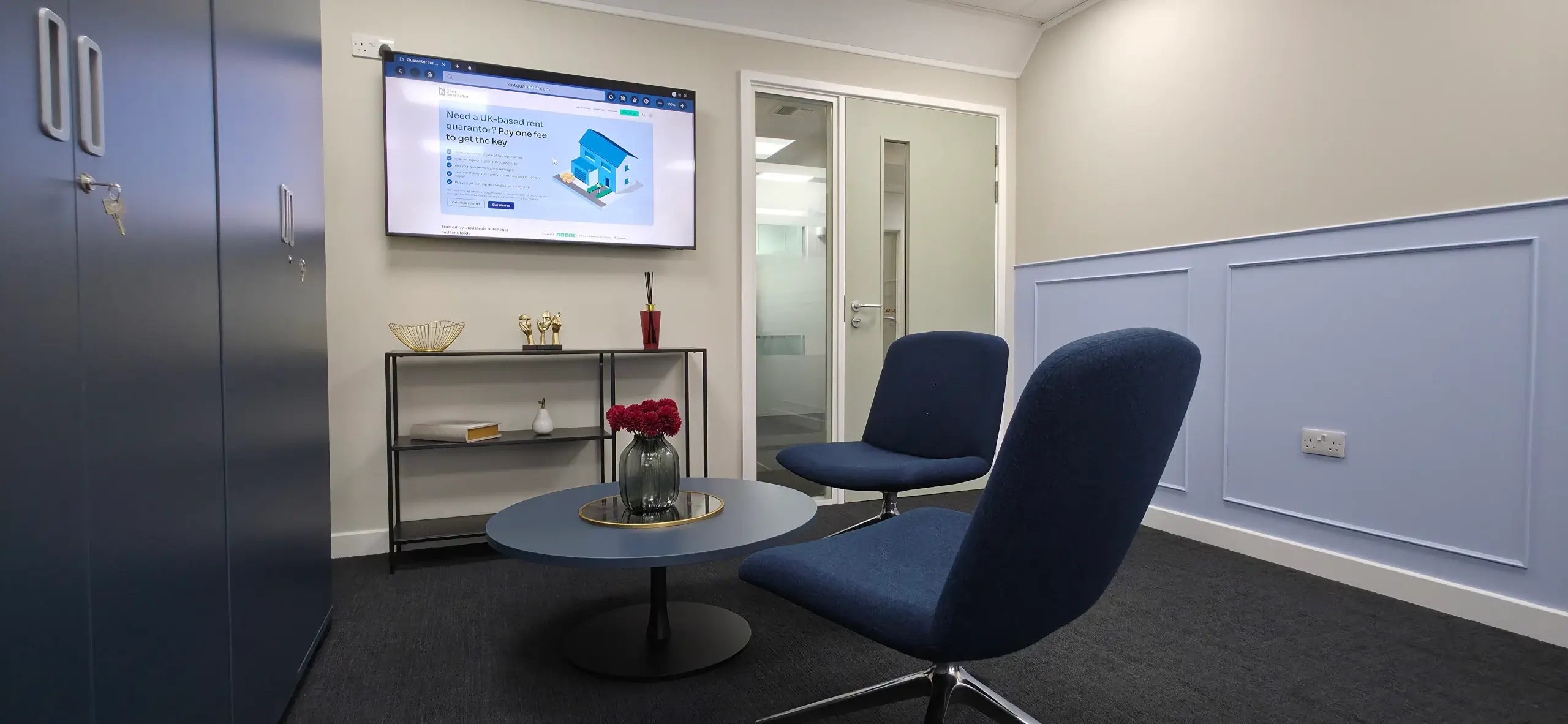
Whilst the room is very light toned, with Dulux’ Egyptian Cotton providing the main backdrop, Fernanda and team paired this with a suite of blue cupboards to provide the storage solution. The informal seating area then picked up on this blue theme and matched the chair fabric to the blue logo felt. Its those small details that really made the difference here.
What was also really pleasing was that the final result matched Fernandas CGI designs perfectly. We now have that multifunctional space that works as intended and reflects the corporate positioning of the business.